Following the switch to Google Data Studio, one of the most common requests from clients I receive is how to view historic report commentary. A key benefit Google Data Studio offers over traditional offline spreadsheet reporting is the elimination of manual data input. Reporting can be automated and configured to update daily, weekly, monthly or even in real time – where data sources allow.
Each month once all data has refreshed, I used to simply overwrite the commentary from the previous month. When clients asked to view historic commentary I would simply send them a PDF print of the report for when the commentary was requested. This provided a low tech solution that just didn’t align with the original objectives for switching to Google Data Studio.
In this post I’m going to detail a method which I use to provide clients with access to historic commentary directly from within a Google Data Studio report.
Step 1 – Create Content Database (Google Sheets)
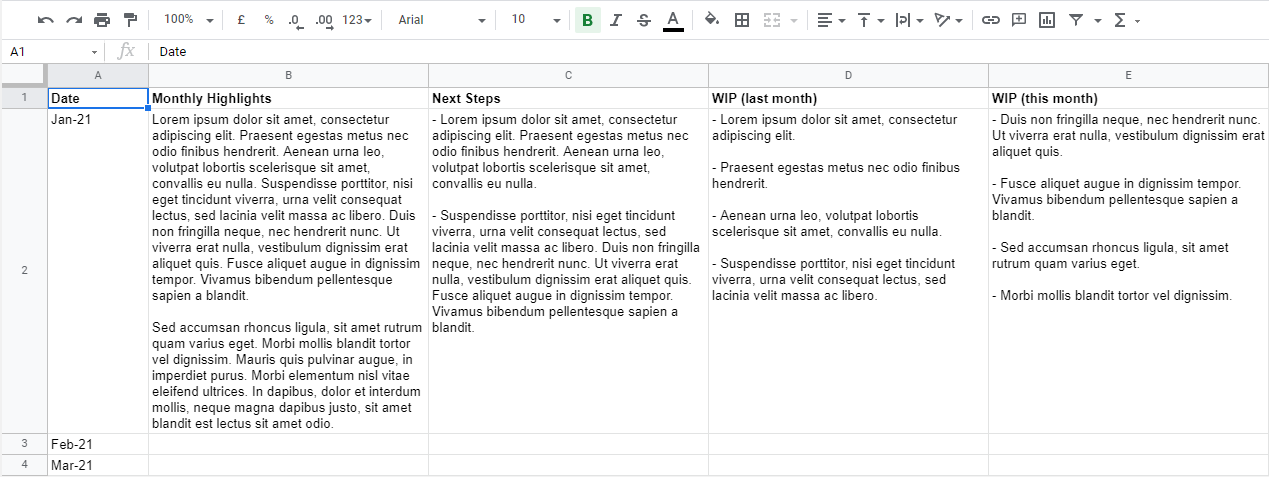
The first thing we must do is build a database where content will be input and saved. One of the easiest methods to achieve this is by creating a Google Sheet.
The first column should contain the time period which the commentary is relevant to. The number of rows will be determined by the frequency which reports are produced. A subsequent column should be created for each body of content present within the report.
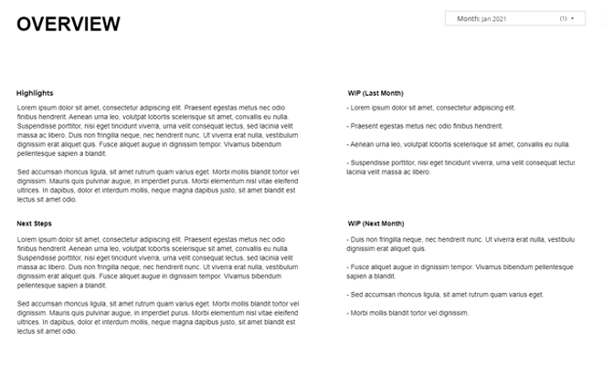
If commentary is provided on a single summary page then only a single entry (column) will be required. However if commentary is provided on a page by page basis then it is likely an entry (column) will be required for each page within the report.
If you have historic reports which you have previously sent then simply create a new entry (row) for each time period and copy / paste in the relevant commentary.
Step 2 – Create Data Source
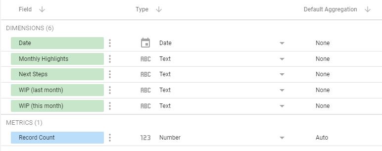
Once you have created your content database the next step is to add this as a data source to your report. Simply add a new data source and select Google Sheets as the connector.
Ensure the column where you specified the time period for commentary is correctly mapped as a date, while all commentary columns are mapped as text.
Step 3 – Add Output Table
Next add a basic table chart, the date range dimension should be specified as your report frequency date field while the dimension should be selected as the relevant commentary element which you wish to display. A further table will need to be created and inserted for each individual commentary element.
To replicate the output of a traditional text box the following styling options should be applied to all commentary tables:
Table Header
- Untick ‘Show header’
Table Colours
- Cell border colour ‘transparent’
Table Body
- Untick ‘Row numbers’
- Tick ‘Wrap Text’
Table Footer
- Untick ‘Show pagination’
- Footer border colour ‘transparent’
Missing Data
- Select Show ” ” (blank)
Background and Border
- Background ‘transparent’
- Border colour ‘transparent’
Chart Header
- Select ‘Do not show’
Step 4 – Add A Control
In order to allow viewers of the report to select commentary from their desired time period, a data control should be added in the form of a ‘Drop-down list’.
Once added the control field should be specified as the report frequency date field with a default selection of the previous time period.
The style options of the drop-down list should be set to the following:
Control
- Select ‘Drop-down’
- Tick ‘Single-select’
- Untick ‘Enable search box’
If you have empty rows within your Google Sheet content database then a filter maybe required to exclude Null values.
How do you currently provide commentary with your data studio reports? Do you include it directly within the report or supply it separately in an email or spoken over the phone / face to face. Let me know in the comments below.
Hi Chris,
Great article. I do the same thing with my clients as most want to see the changes account notes change dynamically with date ranges. I believe if you set a “date range dimension” as date on the selected note table you don’t need to user step 4. Instead this just uses the data from the relevant date range for the entire page of the report. Does that make sense?
Hi John, that does makes sense and you’re correct, step 4 is an optional step. I included it as the default view for many of the reports I produce is across multiple months, for example previous 12 months. For this reason it is often difficult to integrate the commentary date dimension with that of the actual data. Having a separate commentary date selector provides a little more flexibility, however if you are only including a monthly snapshot then completely agree you can skip step 4.