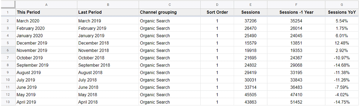
In order to effectively analyse current performance it is key make direct comparisons with historical trends, ideally over matching time periods for example year over year (YoY). In this post I’m going to explain how such comparison can be displayed within Google Data Studio (GDS) using blended data sources.
Prior to the introduction of blended data sources within GDS the display of such data in table format was simply not possible when data was pulled directly from source, i.e. GA, GSC, Google Ads, Search Ads 360 etc. In order to present time comparison data, you first had to compile and process it within a third-party storage medium such as Google Sheets. For a whole host of reasons this was far from an ideal solution.
Early Methods
As an early adopter of GDS you were forced to utilise a third party tool such as Supermetrics to compile data within Google Sheets then via a selection of formulas calculate the desired time comparison metrics, ready to pull into GDS.
While this method worked well at the time it was not without its issues. The most common issues being the requirement for overly complex formulas to take account of elements such as custom channel groupings and frequent time out issues with the automated refreshing of data within Google Sheets.
What is Blended Data?
Fortunately, the introduction of blended data views within GDS in mid-2018 eliminated the above complexities effectively overnight. So, before we get started lets first cover off exactly what is a blended data view. A blended data view allows for data from two or more separate sources to be joined via a common dimension (join key). The data sources can be almost entirely unique (with the exception of the join key) or in the case of this guide identical albeit for the time period captured.
There are essentially two methods which you can utilise within GDS to create a blended data view. These include adding supplementary data sources to an existing chart or creating a blended data view from two exisitng charts. I typically choose this latter method as it provides a more visual and incremental method of creating a blended data view.
Step 1 – Create Blended Data View
For the purposes of this guide I am going to focus on the creation of a YoY comparison of organic sessions sourced directly from Google Analytics, however the principles are the same from other data sources such as GSC, Google Ads, Search Ads 360 etc.
First create a data source which will pull data in from your desired Google Analytics profile.
Next create a chart (basic table) with the below configuration within the data panel:
Dimension = Month of the year
Metric = Sessions
Sort = Month of the year
Default date range = Auto
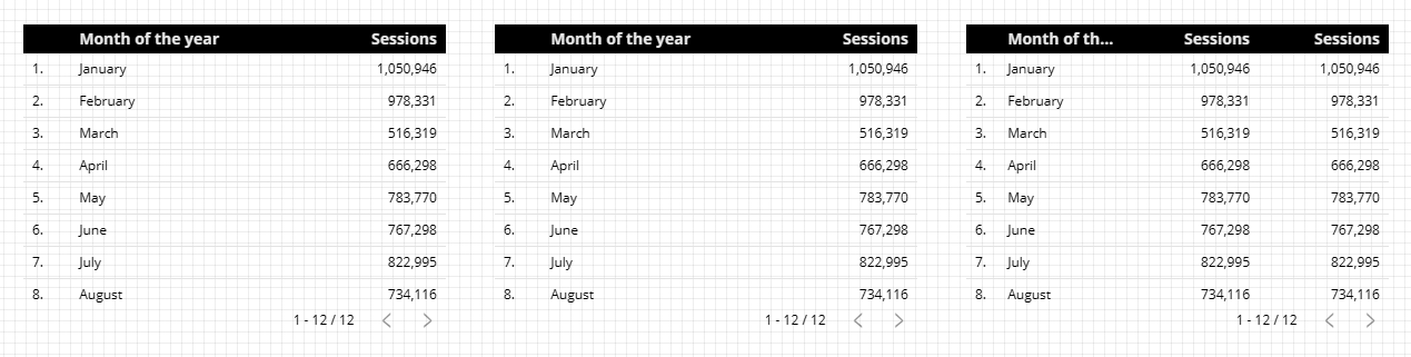
Once this first initial chart has been created, simply copy and paste it so you have two identical charts side by side.
Note: Do not configure the respective dates in each table at this stage as we will be changing the utilised date dimension in the next step.
With both charts selected, right click and from the displayed menu select ‘Blend data’. This will result in the creation of a new chart populated from your newly created blended data source.
At this stage to tidy your dashboard you can simply delete the initial source tables which you utilised to create your blended data source.
Step 2 – Edit Blended Data Source
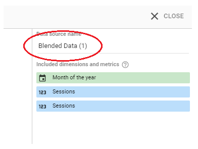
Do not worry if at this stage the contents of your newly created chart are not what you were expecting, a degree of editing will be required. With the newly created chart selected, navigate to the right-hand data panel and click the pencil next to the name of your newly created blended data source. This will open the Blend Data configuration options.
The first change we need to make is to provide a more logical name to your newly created data source:
Next add a supplementary date dimension (‘Month of year’) to the left data source. While we want to blend data on just month we will also want to output the year within our output table.
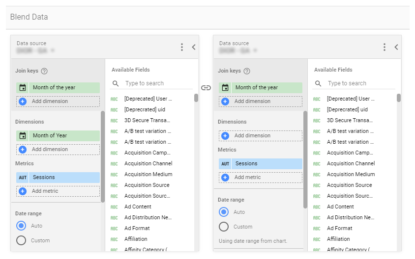
Moving on to the ‘Metrics’ section of each data source, click the pencil on ‘Sessions’ and provide a unique reference to each. Examples could include ‘Sessions (Current Year)’ vs. ‘Sessions (Previous Year)’. The aim is to allow you to easily distinguish each from one another as currently within your blended data source both are simply titled ‘Sessions’.
If you wish to include supplementary metrics, simply add these to each respective data source. For date comparisons the same metrics must be added to both data sources.
Once the above is complete it is now time to define the time periods for each data source. For a YoY comparison configure the following custom date ranges within each data source:
Data source 1 (Current Year):

Data source 2 (Previous Year):
Note: the configuration utilised in the above screenshots will ensure dates automatically increment, requiring no manual adjustments each month unlike if fixed dates were set.
If any filters are required, i.e. ‘organic traffic’ only then these should be configured now and applied to both data sources.
Once all the above steps have been completed click ‘Save’ and close the ‘Blend Data’ configuration panel.
Within your output table ensure ‘Month of year’ is selected as your date dimension and not ‘Month of the year’.
Lastly delete any ‘Invalid dimensions’ from your blended output chart
Step 3 – Calculate % Difference
To help illustrate the relative change between the YoY statistics you may wish to calculate and add a percentage difference figure. To achieve this once again open the data panel and navigate to the Metric section. To include a percentage difference figure, you will need to add a custom metric. First click the ‘Add metric’ button then select ‘CREATE FIELD’. Enter the below new field parameters:
Name: % Difference
Formula: (Sessions This Year-Sessions Previous Year)/Sessions Previous Year)
Type: Number > Percentage
Comparison calculation: None
Running calculation: None
Step 4 – Format New Blended Chart
To complete your time comparison, you may wish to optionally complete the following in order to achieve the optimal presentation:
- Hide row numbers
- Hide pagination
- Apply conditional formatting
All of the above configuration options can be found within the ‘STYLE’ section of the right-hand chart configuration panel.
Hey, Chris. Thanks for putting this guide together.
My Sessions (Current Year) is working fine, but my Sessions (Previous Year) shows “null”. I checked on Google Analytics and I do have traffic for 2018/2019/2020/2021.
Also, some steps from the tutorial are a little different from what we have on Google Data Studio these days.
Could you please check if it is still possible to achieve this?
Thank you in advance,
Thanks for the prompt, it’s been on my to do list to update this guide following Google’s introduction of the improved date and time functions within GDS. I’ve just updated the guide to reflect this.
With regard to your specific issue I suspect that nulls are being returned due to the join key not matching exactly. If the connector was created after September last year then within Google Analytics you should set the join key as ‘Month of the year’ but also include ‘Month of Year’ as a dimension within your left most (primary) data source. ‘Month of the year’ allows you to blend the two data sources as it only includes the month as opposed to the month plus year. You should use ‘Month of Year’ as the date dimension within your output table to indicate the current year.
Hope the above helps, if you’re still struggling do let me know!
Thanks for the article, very helpful. I was initially caught out like Paulo… but then reread the section and looked at the pretty pictures and got it working.
Now my challenge is, how do I make it just show the month.. and not Month Year?
The easiest method to delete the year so only the month is shown would be to use the ‘Month of Year’ dimension rather ‘Month of the year’. Stripping the year however is likey to result in data sorting difficulties if you are including months from both the current and previous calendar years.
Hi Chris,
I’m interested in creating a table with a time series comparison whereby I have
i) different products in rows
ii) average purchase price each product in one column
iii) % price difference vs the previous month in another column beside the column in ii)
I’m looking at MoM comparison and ideally would ideally like to:
i) be able to apply a slicer to the report to select a subrange from the entire date range.
ii) not have to update date ranges on tables as we move through time and future months get added.
Just as FYI, I want my products in rows, because there will be 50+ products depending on the client and at least initially the historic data will be a max of 12 months (so 24 columns), but probably when viewing people will maybe only zoom in on a 3 month period via a slicer.
Is this possible? Any guidance you can offer would be much appreciated.
Hi Cian,
The different elements of what you are trying to create are certainly possible, the difficulty is I don’t see a way you could achieve everything in one single table via GDS.
Option 1 – To display all products in rows + the avg purchase price + % price difference MoM could be achieved via the method described in this post. Avg purchase price is a standard GA field and post blend a custom formula could calculate the MoM difference. The limitation of this method is the data would be limited to a set time period. The number of months could be expanded beyond two by simply adding additional data sources to the data blend for each required month. Additionally each date range could be set to automatically increment but a manual date selector could not be added to the report front end.
Option 2 – If custom date selection by the user was a critical requirement then a basic table could be created (with no blend) utilising the built in comparison date range option. Unfortunately while the % difference vs. previous period is shown, actual figures for the previous period cannot be output.
Option 3 – Lastly to display multiple months in the same table plus a custom date selector then a pivot table could be utilised with the column dimension set to month. Unfortunately dynamic % change metrics cannot be shown using a pivot table.
Hope the above helps sorry its not the complete answer you were looking for. Option 1 I believe would be the closest to your optimal solution, just minus the custom date selection functionality!
Hi Chris
I am not successful in have GDS accurately calculate the % difference. I’m using the correct formula (Pageviews(lastquarter)-Pageviews(YoY))/Pageviews(YoY) however with these values of Pagesviews(lastquarter of 323,960 and Pageviews(YoY) of 239,850 the result should be 35.06% Comparison and Running Calculation are set to none. I’ve run thru all the aggregation radio button options and nothing comes close. What am I missing?
Hi, you need to SUM each element of the formula as a result of the data blend. I believe the term for this is reaggregation. The formula below should return the correct % difference figure:
(SUM(Pageviews(lastquarter)) – SUM(Pageviews(YoY))) / SUM(Pageviews(YoY))
thanks for the article, very helpful & straightforward. I came across with this scenario as i was exploring the data studio.
i want to change calendar period to financial/fiscal period. wherein
Q1 – Apr – June – current year
Q2 – July – Sept – current year
Q3 – Oct – Dec – current year
Q4 – Jan – Mar – next calendar year
i use drop down list filter per year
2016 – 2021 for years
Q1 – Q4 for quarters
i have calculated fields where as
CASE
WHEN REGEXP_MATCH (QUARTER, “Q1”) THEN “Q4”
WHEN REGEXP_MATCH (QUARTER, “Q2”) THEN “Q1”
WHEN REGEXP_MATCH (QUARTER, “Q3”) THEN “Q2”
WHEN REGEXP_MATCH (QUARTER, “Q4”) THEN “Q3”
END
for now, Q1 – Q3 works as intended, i have trouble with Q4 on how it will display the next calendar year, for now in my field i made it current year as this troubling me. do you have any suggestions for this?
Hi, working with any custom time periods always brings up a few challenges when working with GDS. I’m surprised Google hasn’t built in fiscal quarters as a default option as yet within its date selection options.
When working with fiscal quarters / years I typically use the below CASE statements.
Fiscal Quarters:
CASE
WHEN Date BETWEEN DATE ‘2020-04-01’ AND DATE ‘2020-06-30’ THEN ‘2020/21 – Q1’
WHEN Date BETWEEN DATE ‘2020-07-01’ AND DATE ‘2020-09-30’ THEN ‘2020/21 – Q2’
WHEN Date BETWEEN DATE ‘2020-10-01’ AND DATE ‘2020-12-31’ THEN ‘2020/21 – Q3’
WHEN Date BETWEEN DATE ‘2021-01-01’ AND DATE ‘2021-03-31’ THEN ‘2020/21 – Q4’
END
Fiscal Years:
CASE
WHEN Date BETWEEN DATE ‘2020-04-01’ AND DATE ‘2021-03-31’ THEN ‘2020/21’
END
Each CASE statement will need building out and expanding to cover required previous / future fiscal years. Both include the respective fiscal year, this is how I personally work around the issue which you describe.
Hello Chris,
This is very helpful. However when I use Default Date Range to “Auto”, I get only two months (today is July 8th) and by default it does says “Last 28 days”. How do I get an year worth of data with this setting? Please advise?
Thanks
~ Nita
Hi Nita
In order to pull through 12 months of YoY data, the date range within the data blend for each data source needs to be set. For example
Current year: 1 Jul 2020 – 30 Jun 2021
Previous year: 1 Jul 2019 – 31 Jun 2020
The date range for the actual table where the data source is your new data blend should be set to ‘Auto’.
Hello Chris,
How to get Month to Date Comparison.
Example
Month to Date currently means (1 July 2021 to 23 July 2021 ) vs (1 july 2020 to 23 July 2020)
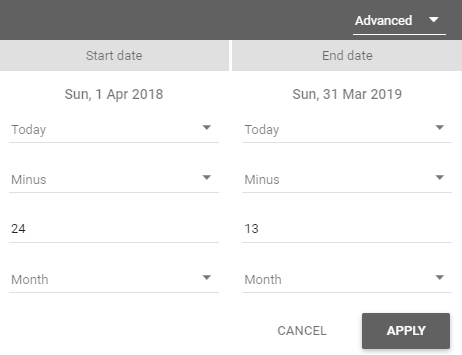
Hi, this is possible but there is a minor caveat for leap years. Keep everything the same as within the above guide but modify the date selections within the data blend to the following:
Current year – set as this month to date (excluding today)
Previous year – from the advanced date selection drop down menu set the start date as minus 12 months and the end date as minus 366 days.
For leap years the end date will need to be increased to 367 days.
Hi Chris,
Thank you so much for this awesome tutorial.
I do have a question, i would like to do this for MoM, and i am not sure how to set the month dates, so it can reflect MoM.
Thank you again.
Hi, to compare MoM figures you will need to modify the data blend quite extensively.
First modify the Join keys within the data blend to ‘Day of Week’. Keep ‘Month of Year’ as a dimension within data source 1. Next rename (Previous Year) to ‘Previous Month’ references where applicable in data source 2. Lastly modify the date range to ‘Last month’ in data source 1 and apply an advanced date selection within data source 2 with the configuration Today minus 2 months for both the start and end dates.
Thank you so much, that works!.
Sorry last question, is it possible to have it list multiple months? for example i would like to see this year, MoM.
Thank you again, you are a genius.
Hi Chris,
I am doing a MOM comparison on GA Sessions. I configured both data sources as you mentioned in the above comment for MOM.
1. Using join key as “day of week”
2. Keeping Month of Year as a dimension in both data sources.
3. Date Range DS 1 – “Last month”
4. Date Range DS 2 – “Today minus 2 months for both start and end dates”
5. Using % diff formula “Sessions this month-sessions previous month/sessions previous month”
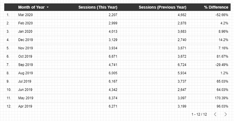
Oct Sessions – 229591
Nov Sessions – 251784
MOM Should be 9.66%
But it is showing 25177700%
I don’t know, where I am doing it wrong.
Also, inside the % diff calculated metric, I am using Aggregation as “SUM”
I tried switching to other aggregations but nothing is working.
I would really appreciate any help on this!
Hi, I believe your issue is related to an aggregation issue. Try wrapping each sessions metric within your % comparison calculation within a SUM() function:
(SUM(Sessions) – SUM(Sessions (previous month))) / SUM(Sessions (previous month))
Hi Chris,
Thank you for this article it’s very helpful! I’m trying to create this week weekly YoY comparison – is it possible to do this with the advanced date setting within two data sources? for the last year data for example: (today – 372 days) and (today – 366 days) to get 2020 July 30 – Aug 5 data? Is there a better way to automate this? I’ll be comparing revenue and sessions for channels.
Thanks!
Hi, the method you describe is one option if you are only wanting to show a single week at a time for YoY comparison. The main issue I can with this method is that it will not provide a fixed weekly time period, e.g. Mon to Sun or Sun to Sat. Unsure if this was your intention? If not I would recommend changing the ‘Day’ option to one of the Weeks options (starts Mon or Sun) and then applying -53 weeks.
If you are wanting to display multiple weeks for YoY comparison then you could change the join key from ‘Month of the year’ to a date with the type configured to output just the ISO Week (minus the actual dates). The only limitation out of the box with this method is it will only allow you to compare weeks Sun to Sat.
Hi Chris,
Thanks for the tutorial. VERY helpful.
I’m trying to create a MoM impressions, CTR, clicks table. Data source is Google Ads.
My current month metrics are working fine, but my previous months show “null”.
I’ve checked the join keys and they are all matching.
Any idea on how to troubleshoot this please?
Thanks
Hi, as you’ve highlighted one of the most likely reason for the null values would be an issue with the join key. If values are only showing from the left data source and not the right within the blend, then I suspect this is almost certainly the issue. The join key should be set as ‘Month of the year’ and not ‘Month of Year’ as the latter will also pull in the year resulting in the keys not matching.
I have an issue at the moment with blended data whereby the ‘Comparison Date Range’ (for Previous period) doesn’t show any values in the vs delta columns in a data table. The ‘grand total’ summary however does show a value.
My data is combined google/FB ads data (housed within a Google Sheet) with rows of daily spend segmented by campaign with a ‘Source’ field to distinguish between the two ad networks. This is blended with Hubspot data joined on date/campaign name as I want to show other Hubspot metrics attributed to the ad network source, but even on the original table, i struggle to get this to show a ‘previous period’ comparison of spend (or any other metric). Eg. how does August 2021 spend compare with July 2021. The only dimension in my data table is ‘Source’ and then the spend metric is added. There’s a date range control added on the report. Any ideas? Thanks in advance for any help!
Hi, the issues you describe I suspect are a result of inconsistent join keys, most likely the date format as the campaign should be fairly straight forward. Dates in Google sheets can sometimes present issues due to applied formatting masking actual values. The date format within the join keys must all match, in order to achieve this you may need update at source within your Google Sheet or alternatively duplicate the original date field within GDS and adjust its format here.
Hi Chris, I am trying to put a score card that shows comparison of sales this year over last year, my problem is with the conditional formatting, I want to show any increase that is 10% or more in green, less than 10% in red, not all positive in green and all negative in red, is this possible?
Hi, I don’t believe there is a way to do this natively within the conditional formatting settings for a scorecard. The only way I think you could achieve this currently would be to create a separate chart (table) where you calculate and output the percentage difference. You could position and adjust the styling of the table so it mirrors that of a standard scorecard comparison metric. For the table you would need to disable header, pagination, row number visibility etc so only the actual percentage difference metric is displayed. Once you have this configured you could apply your required 10% or more in green, less than 10% in red conditional formatting.
Thank you for your reply. Will try this.
Regards
Hi very helpful! I am trying to compare week vs week but gives me error. can you help me?
Hi, could you provide more details of the error and I will try to help you resolve the issue.
Hi, this is very helpful! Currently I’m trying to make an analysis based on hour to hour comparison but I’m struggling with doing this correctly in Google Data Studio.
Ideally, I want the following:
1) The Ad Exchange eCPM of today per hour up until when the data is available
2) Yesterday’s Ad Exchange eCPM per hour
3) the percentual difference between yesterday’s hour and today’s hour. So essentially I want to be able to show the percentual difference of the same hour on two different days.
Also, I want to be able to filter this per Country, Ad unit, and Mobile device.
Do you know a way in which this is possible? You would help me a lot!
Hi, this sounds a really interesting analysis, not one I have personally built out to date.
What you describe should in theory be possible. Use ‘Hour’ as the join key and then specify ‘Hour of Day’ as an additional dimension in the first table within the data blend. Once you have this configured you will be able calculate the % difference using the same method as the one described for YoY within this post.
The only issue I can see is with the filtering of this data. You will be able specify static filters within the data blend e.g. limit to mobile traffic only, but dynamic filters via a series of dropdown menus on the report front end would not be possible. This is due to the fact you would need to also specify these dimensions as join keys and unfortunately they are not compatible with the method described in this post.
Hi Chris
I just can’t get mine to work like that!
I have a Date of Incident field formatted as “Date” but I am trying to use Record Count as I don’t have sessions or an equivalent
I created both tables and when I tried to use the Month of Year field from the blended data it said the dimension was missing and when I tried to use the Date of Incident field from the left table as the dimension the month names either turned to a single digit number corresponding to the month or a large 10+ digit value
I followed everything to the letter several times but the result remained the same
Is it because I’m using Record Count?
Hi, I don’t think the issue you are experiencing is related to the ‘Record Count’ metric. The method in this post should work with any metrics so long as the data blend is configured correctly.
The issue sounds to be related to your data blend. As a first step I would ensure your date fields are formatted as required. You need to blend the two tables on a date format which does not include the year, e.g. ‘Month’. Then add a date dimension which includes the year as an additional dimension to only the first table, so this is available in the output table to show the current year.